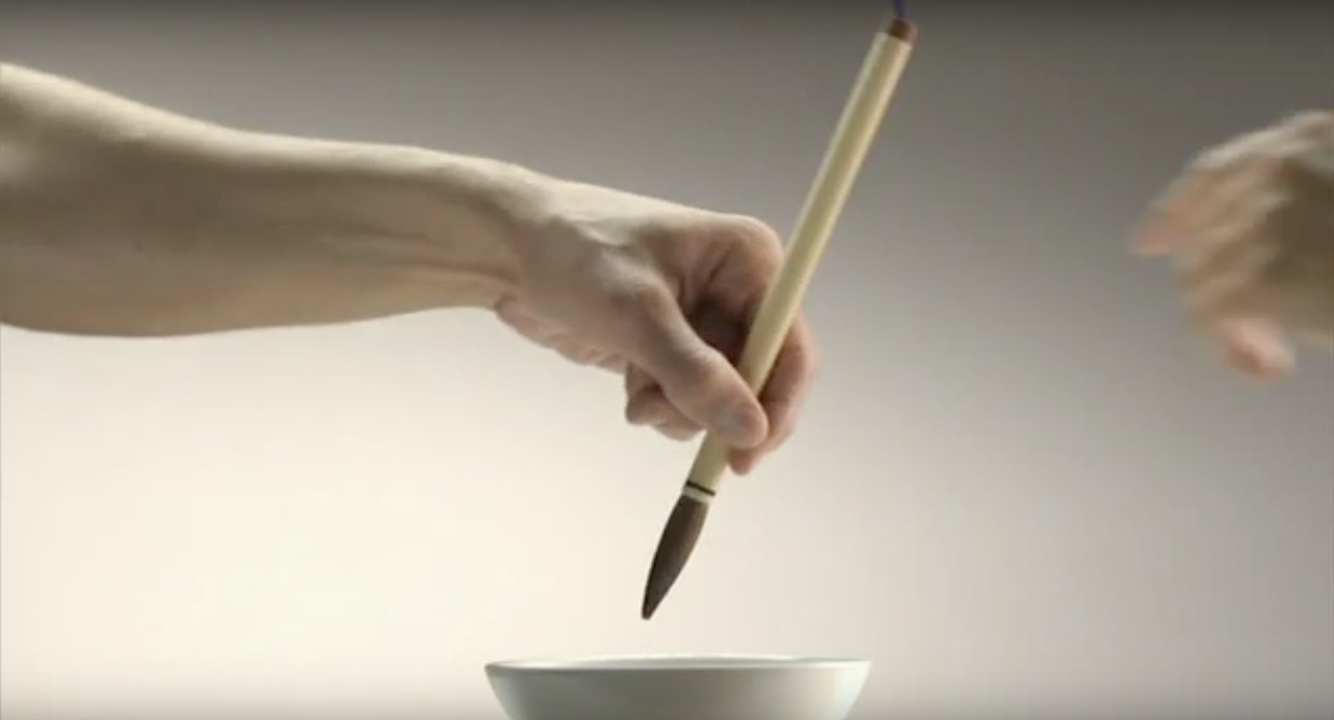
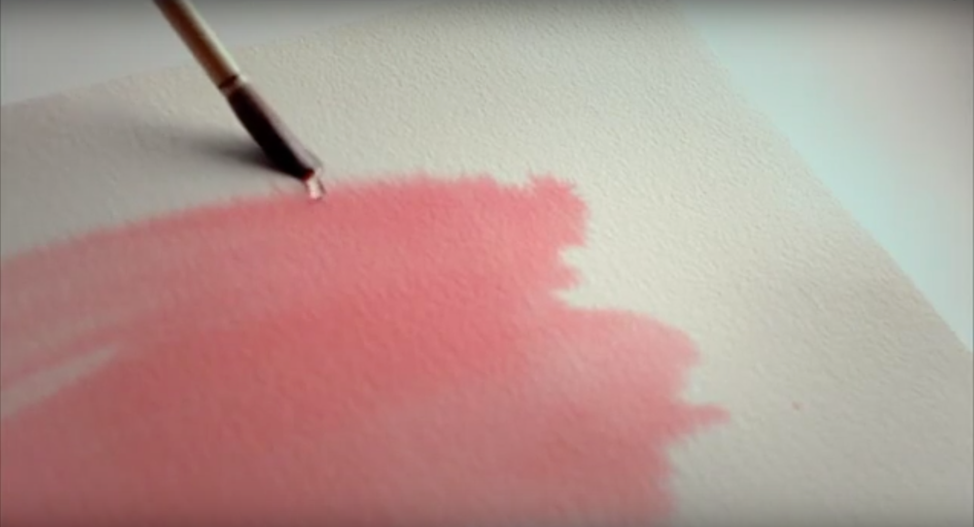
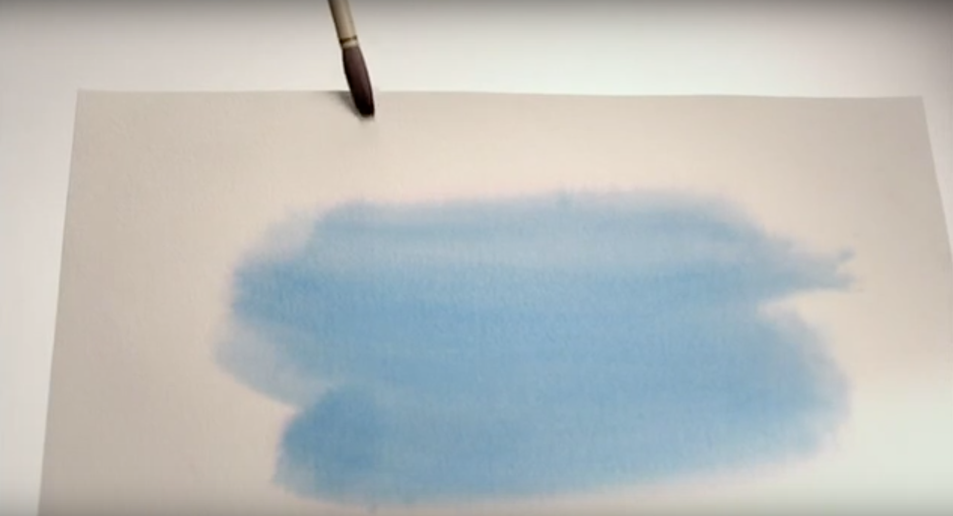
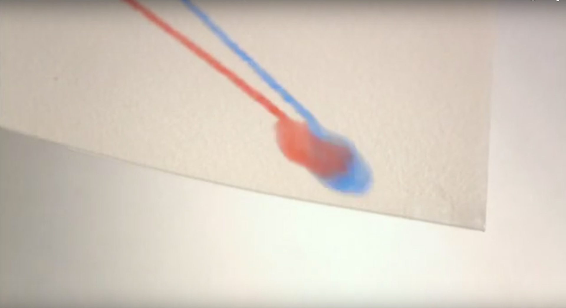
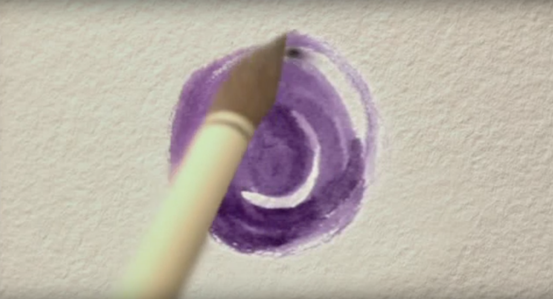
The film's concept, was to recreate the merger of both banks through their respective colours. Blue for Bank Populaire, and red for Caisse d'Épargne. The addition of the two colours give this purple colour, both powerful and unused in the banking industry. As both drops come together and merge, the bigger drop, falls off the paper and drips on the the final material. A brush then comes and mixes the drop to make it into a circle sybolizing the specificity of the human touch in today's world.
—
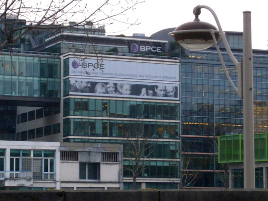
French Banque Populaire and Caisse d’Epargne groups have merged to form the second largest banking institution in France and third in Europe.
—
The symbol was created to symbolize the world, its perpetual movement and change, and the human centric philosophy of the BPCE group.
—


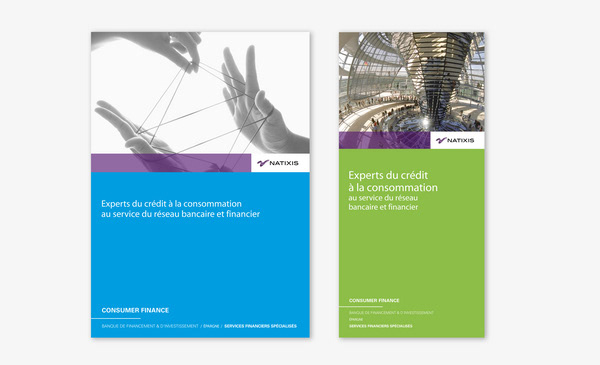
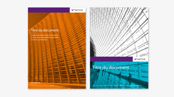
The Natixis brand is BPCE's entreprise banking division. As a child brand, it retains the illustrative feel of BPCE's symbol, with a dynamic and vivid movement. The rebound conveyed in the symbol was needed as the bank was entering a new era.
—
—


Film concept: Reza Bassiri. Art Direction: Francesca Sangiorgi Mund / Laurent Habib. Creative Direction: Reza Bassiri. Agency: Euro RSCG C&O.